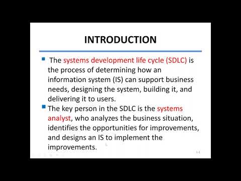


This comprehensive course on Responsive Bootstrap equips you with the skills to create fluid, mobile-first websites using Bootstrap’s powerful grid system. You will learn how to effectively scale your designs across various devices and viewports, ensuring a seamless user experience. By the end of this course, you will have the knowledge to build responsive websites from the ground up, utilizing Bootstrap’s features to their fullest potential.
Course Content
المحتوى
-
10:18
-
10:18
-
10:18
-
10:18
-
10:18
-
10:18
-
10:18
-
10:18
-
10:18
-
10:18
-
10:18
-
Final Exam – Mastering Responsive Bootstrap Development
A course by
A
Student Ratings & Reviews

No Review Yet
 Lessons: